

Assignment 5
- Feb 1
- 16 min read
Updated: May 12
Although there was great encouragement from my tutor, I was a bit reluctant to begin this assignment, as I couldn't see how my idea aligned with the requirements. Being inventive and experimenting with different (perhaps never done before) outcomes, this idea didn't feel right. But I just couldn't shake it. I couldn't think beyond this idea, I felt compelled almost, like it has become my duty. So despite my doubts, I decided to fully commit to the project and have become extremely passionate about making it a reality. So here we are, moving forward! Which might actually be the essence of what this assignment is asking, that I was so worried I was not meeting.
In Part Four I started a self initiated project after being invited to hold an exhibition at my local Library. This project was "Where the Water Flows" a celebration of the volunteers that help conserve the River Chess in and around Chesham. Little did I know that I would quickly develop a huge interest in the River Chess through this project, all thank you to the incredible people who shared their knowledge and passion with me. The more I learnt, the more fascinating I found the River - I instantly felt that everything I had learned, and continue to learn, was perfectly suited for a children's book, and this was calling for me to do it.
Whilst my portrait series continues with a second public exhibition scheduled for December, it felt like the perfect opportunity to further my research and create a Children's Book alongside the portraits. Both projects are very much inspired by the volunteer work, and so, as I begin to meet a new wave of people that are to be included in the portrait series, I am able to join in on more volunteer activities to gain a deeper understanding on what they do to help conserve the river and why it is absolutely important.
I have gathered snippets of incredible information about the river from various sources so far, such as word of mouth, getting involved with activities and training days, and with searching through a few informative websites. There are so many things I would like to include based on this alone, so my initial step in this project is to attempt listing the points I wish to cover. This list is not final, as I will uncover more details along the way, however, this seems like a reasonable place to start.
It must be known that working on a Children's Book is not exactly new to me; however, completing one entirely by myself is. The second thing to note, this particular project will be an educational book for ages 7-11 (roughly), which is an entirely new territory for me. In the past, I've created stories, most of which have never progressed or were fully completed, I have also illustrated other peoples stories. Educational books, however, represent a completely different area for me, one I never imagined I would explore as I just never consider myself qualified to do so. It involves thorough research to gain a deeper understanding of the topic/theme, ensuring that any information included is factual and accurate. If done right, should also involve real conversations with experts in the field to help build on this. This is all quite different to creating a fictional story, although fiction does sometimes require a level of research if referencing real places, events, or based in a certain period. As my project focuses on the River Chess, all information that I include needs to be "fact checked", which is what makes this feel both alien and exciting for me.
How do I begin?
Taking on a project like this can be a bit overwhelming. The information you gather is exciting and very motivating, however, it can feel widely spread, leaving you uncertain about what should and shouldn't be included. Although it's too early to determine this exactly, I can still draft a basic outline highlighting some key points that I believe will be essential to include. To begin I scribbled some notes in my sketchbook based on what I had already gathered, whilst researching more points to consider through various websites.
I rattled off a brainstorm of thoughts that I thought would be key things to include in the book, it was also a way to get started in the sketchbook and empty some of the thoughts.

In the meantime, a second starting point I felt was important was to research what educational books were already published, looking at style, layout, and also the direction they had taken to successfully reach their target audience. I went out to the book shop to find books that I wanted to aim for in terms of size, page count, style of information vs illustration, and overall quality I would like to achieve as the final piece. There were many options available at Waterstones, however, only 2 titles really caught my eye in the way that ticked all the boxes.
They stood out for different reasons, and yet both of them felt valuable to my research. A third book found me at the right time, this time whilst on a trip to Poland. Here is a short summary of the 3 books that I will keep close by when putting my book together, and the reasons why I think they are valuable.
Hike It!
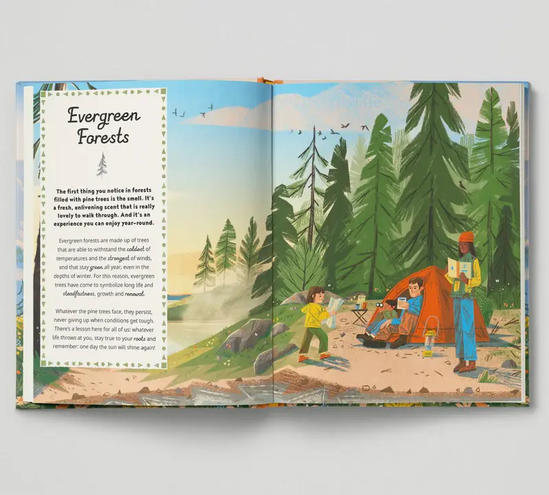
My top choice out of the 3 is a book that introduces you to hiking, camping and backpacking, called "Hike It!" written by Iron Tazz and illustrated by Martin Stanev. This book is beautiful, the illustration style perfectly suits the tone of this book, both in the level of detail and the textures used. I love how Martin has captured the landscapes balanced with pages that list essential information about each segment that it discusses. It's a very clean layout in how they combine the illustration with the written information, it feels mature yet easily digestible for a younger age that might be sharing the reading experience with a grown up. The book feels amazing, the hardback cover has a premium cotton feel to it and the size is perfect. This would be the size I would aim for with my own book. In most cases, this book feels to be the biggest inspiration when working towards my own book.


A Story Of The Seasons
This book appealed to me for the nature of the book. It covered topics that felt relevant to my own subject/theme which felt like a valuable resource in terms of the way it is written. I also find that the layout doesn't feel too repetitive in that each page offered something a little bit different, allowing you to scan the entire page and discover the wildlife or nature they share information on, almost feeling similar to being at the location in person and finding the wonders around you. Hike It! was quite different in that each segment followed the same layout, the difference being, of course, that both books are designed for very different reasons. Hike It! is an essential guide to surviving outdoor adventures (although includes a disclaimer to say that it is not a survival guide exactly), the design almost urges you to follow the guidance for safety which makes this a must have book for any young hiker, camper or backpacker, whereas A Story Of The Seasons is more for the nature lovers, each page full of lushes illustrations that describes each season. It's a great source of inspiration not only for the beautiful drawings, but because it is actually based on the English landscape. The text is a simple font that could be more suited to a slightly older age range, and the illustrations could appeal to younger nature lovers with grown-ups reading for them, this design feels to allow for an interactive experience.
Content aside, the second reason this book appealed to me was for the publishing information. A Story Of The Seasons is published by Nosy Crow in collaboration with the National Trust. Given the nature of my own book, I wondered if there could be a way I too could have this published with the support of National Trust or other relatable organisation. This felt like a very valuable discovery for future Helen, when my own book is further along and there is something I can pitch.

Tatry
The third book in my collection is from Poland called "Tatry" which is a guide through the Tatra mountains. This book has a few valuable elements to it that I find to be a great resource. One point that makes this an interesting book is that the author co-wrote the book with former director of the Tatra National Park, Pawel Skawinski, who was also a Tatra guide for 50 years and a volunteer rescuer for many years. Like his incredible role and experience within the Tatra mountains, Pawel Skawinski is transformed into an illustrated guide in the book. Featuring throughout each page, the design lends itself to bringing humour and factual callouts that feel as though you are there with him in person. It's a great way to bring personality into a book for children, and having a consistent character that works very well makes for a great opportunity to continue the series.

As I have been incredibly fortunate to meet highly experienced and knowledgable people who work on the River Chess, including them as characters within the book could be a great way to celebrate their work. Like Tatry, different characters make an appearance to share stories, tips and other useful information that will help both children and adults learn the ways of the mountains, such as bears and other animals/wildlife that live there, plus mountain people with a tale or two to share. Could the same work along the river?
It's a really charming book with a fantastic style that I really appreciate. It measures the same as Hike It! with both size and page count. I love the use of a map of the mountains as the interior of the book covers, something I find to be a very thoughtful use of these pages that are often kept as decorative - something to consider as I intend to include various maps throughout the book.
Each book is of great value in terms of how they can help shape my own story. Each provide a different way to educate on a specific theme or subject. Not only do I find the design choices for each important to note, but how they communicate and make the topic engaging is something I am interested in understanding. Each book feels to be aimed at similar ages, the text and imagery is not too young, yet the large illustrations stretched across the pages make it so that it can be enjoyed by both children and adults. This is exactly what I would like to achieve with my book, with hope that the book can be enjoyed in schools and in homes.
With those now at my disposal, plus a list of ideas developing on what to put in my story, I was ready to start mapping out a foundation.
Following the dimensions of Tatry and Hike It! my book will be 265mm x 320mm with a page count of at least 80. Knowing this, I was able to create a template for each page where I then printed it onto A4 paper so I could make notes on top. I had purchased a simple A3 sketchbook for this project and so stuck this guide to act as a bit of a checklist as I progress.
I liked the visual format of this idea, and feel it will be something I will refer back to often.
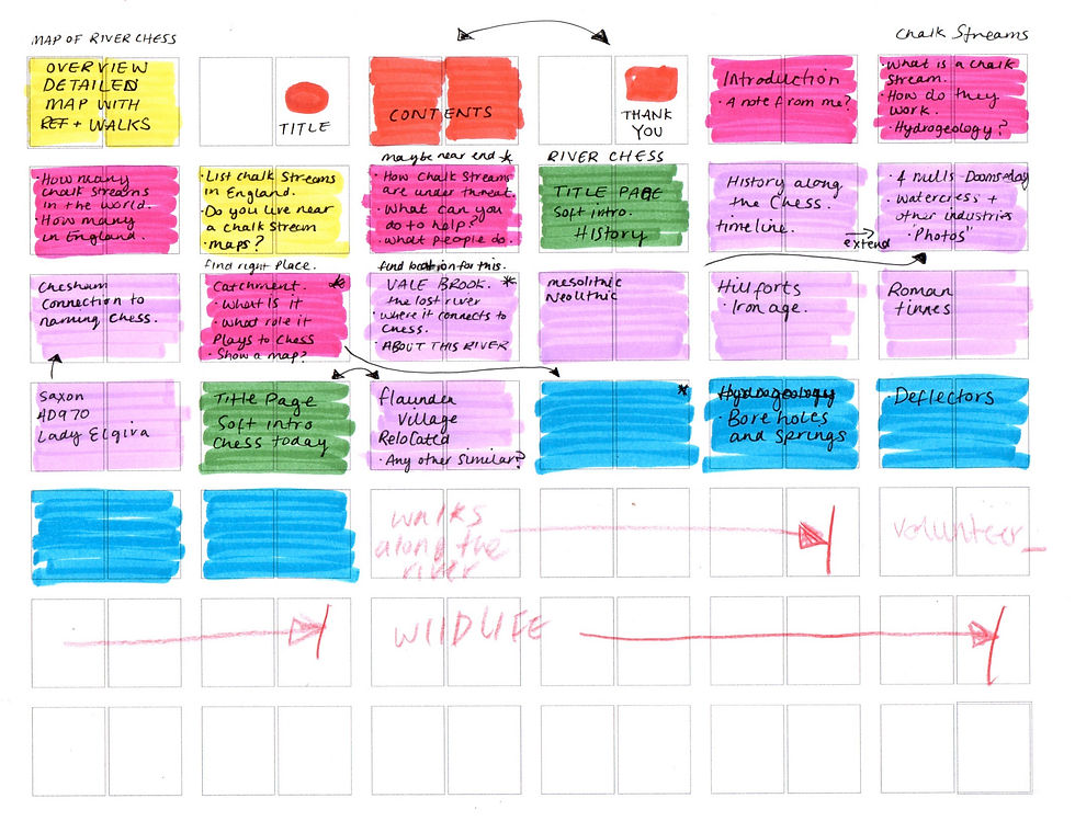
To further help with planning and essentially "getting through" this project - I decided to try something new to help me stay organised and on track. Using Monday.com as my tick list I can create multiple sections, keep coloured tabs on progress, set timelines and more. Here's an example of what I had set up so far, taking a closer look at some ideas for the first Chapter, "Chalk Streams".
Chalk Stream Chapter shows a drop down of page ideas and topics. The Status is an overlook of where I am with the particular ideas, with Illustration and Text acting like individual progress bars. My idea behind this was inspired by comic artists. I had seen Comic Artist CROM use a check list in a sketchbook, along with other artists using very similar tactics to keep track of the pages. Whilst I still may just end up using my sketchbook to log the progress, I wanted something clean and... colourful! something I would find visually pleasing and manageable to help my focus.
Ok so now that I had this setup and a growing vision of what this book will look like. I was ready for the next step.
Photos
Since starting the portrait series, and now this children's book, I have been taking my camera along to any and every opportunity that came my way. I have collected many photos of volunteer activities, walks and talks, and more. I thought it would be best to pick out the ones I think will be most useful. Some I have taken with double page spreads in mind, others are for more perhaps callouts that can be used across the book. The rest would go down to research, things I can reference at any point. I didn't want to miss anything and so even took some videos along the way.
An additional idea I did have was to possibly include QR code interactions within the book that would lead to a website with some of these real life photos and videos. I thought it could be a nice way to expand the book and perhaps include activities for additional learning. There are already many websites that provide information, but to be designed as a continuation of the book just for children could be really interesting! Perhaps I can explore this.
Here is a round up of some of those images.

Impress the Chess
" Impress the Chess is a partnership between local authorities, conservation bodies and community groups to protect and restore the River Chess, a chalk stream flowing through the town."
on Thursday 29th January the local council, in partnership with groups that work together to restore the Chess, organised a gathering for locals to hear the latest on what's been happening along the river. This was a great opportunity to take a few notes about areas that would benefit the book. The rise in Water Voles, understanding the cause of flooding, and catching some keywords that could be later useful when researching.

Some photos from a few of the presentations:


A timeline at the event:


It is exciting to learn about the River Chess, and about chalk streams in general. I have never felt so invested in anything like this before and it's really fascinating to learn about something so incredibly important. These events, meet-ups and every interaction I have with someone that is involved with the river in some way has been greatly appreciated and deeply valuable.
Yes I do feel as though I am swimming well out of my depth on this, but the more I immerse myself and show up to gatherings, the more I feel this book could be of value, not only for the community but nationwide!
Thumbnails
Like the page layout I had printed and added notes to earlier, I wanted the initial brainstorming of thumbnails to be in a similar format. This is the stage where I really want to focus on visualising what the pages could look like. Here I am asking myself: Do I work towards a pattern in how each page will flow from one to the next? or should each page be different? How many full page spreads will I include? Will I have clear chapter/title pages? How should I incorporate illustrated maps? How much text should each page have? Should each chapter have the same amount of pages?
This is where my sketchbook comes in handy. However, just to get the very first attempt out the way, which will no doubt be rough and... well... rubbish. I actually want to start with the iPad. I know, curse the digital world! This should definitely be done directly in the sketchbook. But hear me out. I haven't decided on the style I want to go down for this book yet. I am not sure whether I actually want this to be finished digitally. I am considering making this traditionally!
The fact is, I just want to rough this out in the most basic form. If something works then I will print it and then continue working the sketchbook. The reasons digital sketching can be useful at this stage is the fact you can easily cut things out, move it, expand it, erase it, scrap it, flip it, warp it, and whatever else you may need.

Whilst jotting down a few thumbnail ideas, I began thinking about the style I wanted to aim for. A piece I had created in level one - Graphic Fiction, jumps to mind.

This piece was part of an older exercise where you had to recreate different seasons in one landscape. There's parts to this that I feel could be quite nice for this book. I like being able to see the texture of pencils, with other background colours being seen underneath, giving a layered look. How much of this will I be inspired by is unsure, but I do enjoy the warmth and texture.
Another illustration I had done comes to mind for similar reasons.

I think I would like to achieve something between both of the examples, whilst also exploring alternative options that might flow naturally due to the subject matter. In other words, whilst I will go in with these images in mind, I will also allow for flexibility, responding to what works best. To help, I created a mood board of styles I thought could be interesting.
To get to this stage, I will first focus on one double page thumbnail to explore different styles. Once I land on something that feels right, I can then progress more pages to match.
I began with sketching super rough page on ProCreate. I focused on the Flow Deflectors, showing what they are, how they are built, and explaining what their purpose is.

Here I then had my first test of exploring colour and style of colouring.

I kept with just using pencil brush on this and half way through felt it just wasn't the look I wanted to go for. I want to be able to have a mixture of different textures and brushes in the piece that adds interest. I think it's a good start at seeing what can work, from here I can identify things that I don't like and where I can make changes for the second draft.
---
Truth be told, I have very much struggled to get back into this course after spending months working on the portrait series for Assignment 4. In fact, my whole energy has shifted toward portraiture the last year since getting on to Portrait Artist of the Year. I've found it extremely hard to bring my energy back to this style of work, and I still do.
I'm stressed when thinking I have just one last project to complete (this one) and only a few months left until my course deadline is over. I'm stressed because I just can't seem to do it. I'm excited about the idea of creating a children's book based on this subject and project, but at the same time feel well out of my depth in actually putting this together.
I have thought of simplifying the results for this assignment so that I can manage it better. Instead trying to overachieve with a huge task of completing an entire book, I decided to focus on demonstrating parts of the book. Create a front cover, the contents page, and a double page spread would be the minimum expectation to put on myself. To fully complete this book I would need at least a year to get everything done, from writing to proof reading, to illustrating and testing. I don't feel it is a project that can be rushed and have corners cut on.
Picking up the pieces of where I had paused, I find myself unable to progress sketches into final drawings. I feel a little stiff with my illustrations when working digitally sometimes, however don't feel I can deliver the style I want to achieve if done traditionally. Sketching on paper feels far more loose and natural, but I'm quite nervous to paint the illustration. Digital definitely comes with its benefits - an unlimited colour palette and an undo button for example, but I really would like to experiment traditionally.
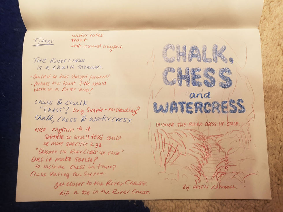
I had started creating some thumbnail sketches for a possible cover, also playing with a potential title for the book. I wanted the cover to be based on a popular part of the river, however to include elements that can be seen in different areas to suggest what kind of things will be featured in the book, for example, deflectors. I wanted to include a few famous faces that can be spotted along the river too.

With the sketch that I liked most, I moved over to the iPad to explore different brushes and textures that could work.

I then chucked some text on top to get a feel of this being the cover. I like the bubbly font and bright green colour, I feel this could be gloss on top of the matt finish print which could feel more eye-catching and modern. The black text is lost here, but using white just didn't feel to fit. I think this could be worked on further to improve the readability.
My first attempt for the cover is ok, but it doesn't quite feel right. I think I want to consider the design of it further now seeing the text on top. Select a clean colour palette that can work well with text overlaying it. I think I might have over worked it slightly.
I like the textures I have created but feel it could be improved on. Now that I have shaken the cobwebs with working digitally and completing a first draft, I feel as though I can approach the second attempt in the way that feels more stylised in the decision making.
To be continued...
After feedback
To pick up where I had left, I decided I need to start with putting some text together for an intro. This felt as though it would help set up the direction and tone of what could come to shape this book. Here’s a few photos of the document I had started to build for opening introduction.


I felt as though I was on to good a start which makes me very excited to continue. In the meantime, whilst I working on text, I knew I wanted to draw maps that indicate where the chalk streams are located within the children hills, plus a bigger map that show the most famous chalk streams in the UK, as mentioned in the text above. For this, I pulled a few images from Pinterest that I felt inspired by for their style and level of detail.

I then had my first attempt of drawing my first ever map, which is far from. Being accurate but felt ok for my first try.
Started with adding an image of the children hills map from google and warping it to hem- me create a sort of 3d perspective whilst still being flat. The reference above has examples of the view I am kind of looking to achieve, images top right and bottom right.

I tried to place some hills but they are not really accurate…

Honestly, I kind of don’t wanted to continue this version. It feel to similar to what you’d expect from google maps and not a children’s book. I certainly plan to try this a few times until I get something I like. I will then try and create the final piece using traditional methods rather than digital, which is possibly the technique I might experiment with for the rest of the book.
Whilst collecting the map references, I came across a book cover from Sara donati which had caught may eye for the colour and texture. I’m drawn to digital artworks that looks sketchy and textured, this cover being a great example. Below is a quick sketchy study I made on procreate using just 2 brushes.

--- Links: